I recently came across a data set that contains detailed employee information at Metro-North Railroad. It includes names, addresses, position titles, marital status, military status, and other data that could be useful in mapping employee demographics. In this series, I will cover age, ethnic makeup, hourly wages, and map where employees live.
Step 1: Setup and Cleaning
I prefer loading all necessary packages at the start to accomodate the inevitable idea fairy. Also I hate typing require() or library() more than once.
libs <- c("class", "plyr", "tm", "data.table", "tidyr", "dplyr", "igraph", "ggplot2", "leaflet", "ggmap", "choroplethr")
lapply(libs, require, character.only = TRUE)
For the sake of brevity I have only included a small snippet of the data cleaning code. During this step I also used the ggmap package and geocoded concatenated employee addresses for further analysis.
#Set Options
options(stringsAsFactors = FALSE)
biodata_vw <- read.csv("~/Documents/Data Science/MNR - Employee Information/MetroNorthEmployeeApp/biodata_vw.csv", sep="")
### Clean the data ###
db <- biodata_vw
db <- filter(db, DESCR10 %in% c("Active","Leave","Leave W/Py"), HOURLY_RT != 0)
db <- rename(db, "RACE" = DESCR50, "JOB_CAT_SHORT_01" = DESCRSHORT, "JOB_CAT_SHORT_02" = DESCRSHORT1,
             "MNR_ID" = ALTER_EMPLID, "EMP_STATUS" = DESCR10, "ACTN_REASON" = DESCR1)
##Step 2: Exploring the Data
After doing a lot of cleaning and geocoding we can use the ggplot2 package to first create some simple charts
###General demographics
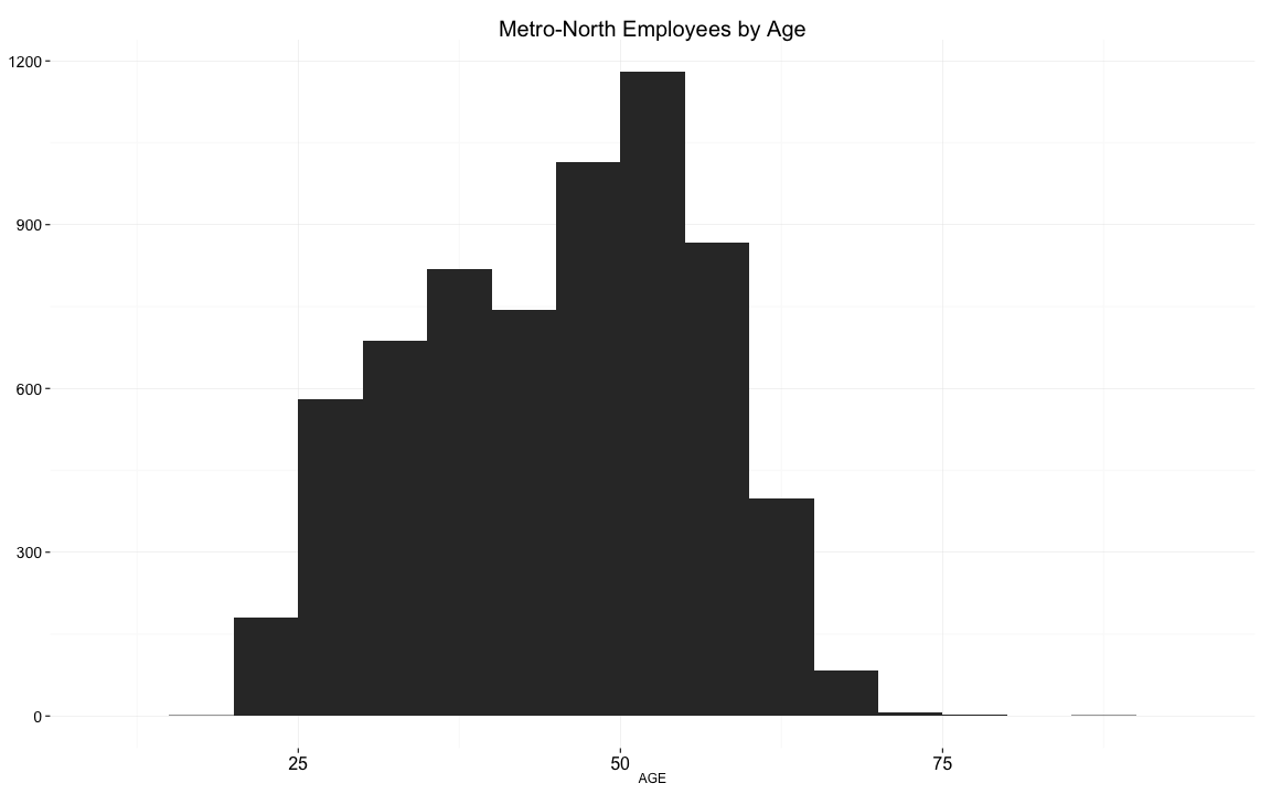
#### Age
We bin employee ages in 5 year intervals to reveal a fairly old company
Ethnic Makeup
Metro-North is roughly as diverse as the entire United States population, with a much higher representation among African Americans.
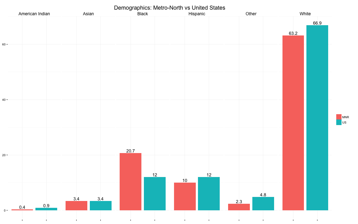
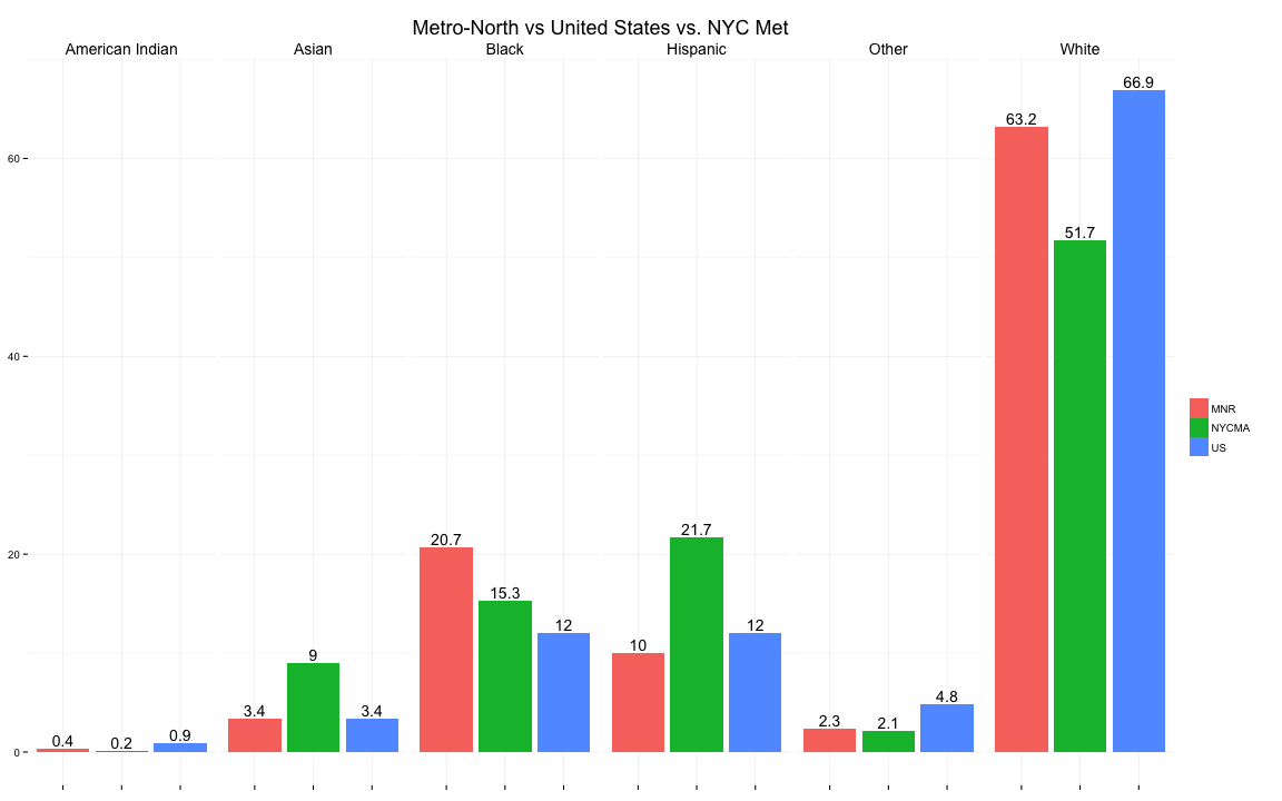
However, the demographic makeup of the New York City Metropolitan Area (NYCMA) is more diverse than the United States. Relative to the NYCMA, African American + Caucasian Americans are over-represented at Metro-North, while Asians and Hispanics are under-represented.
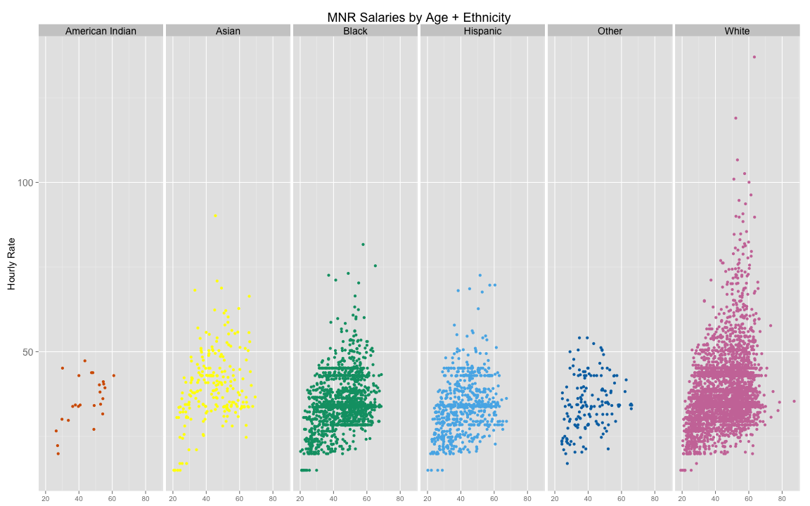
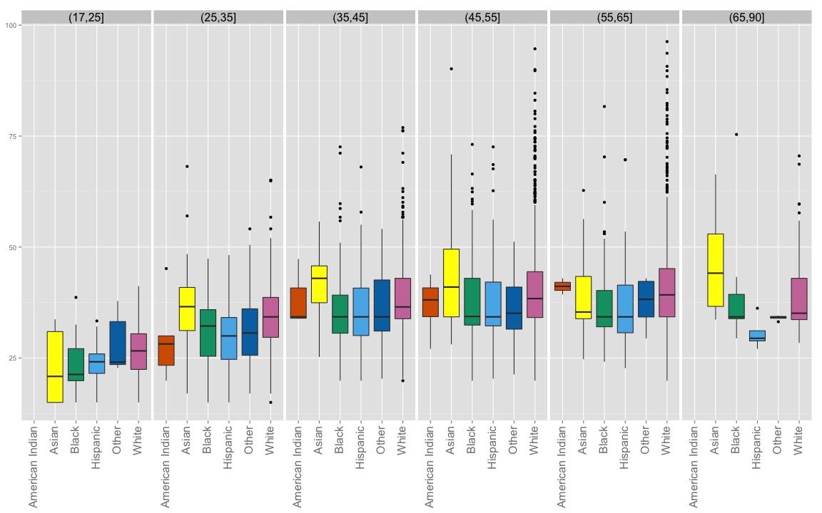
Hourly Wage by Ethnicity
We plot the hourly wage of each employee and facet by their ethnicity
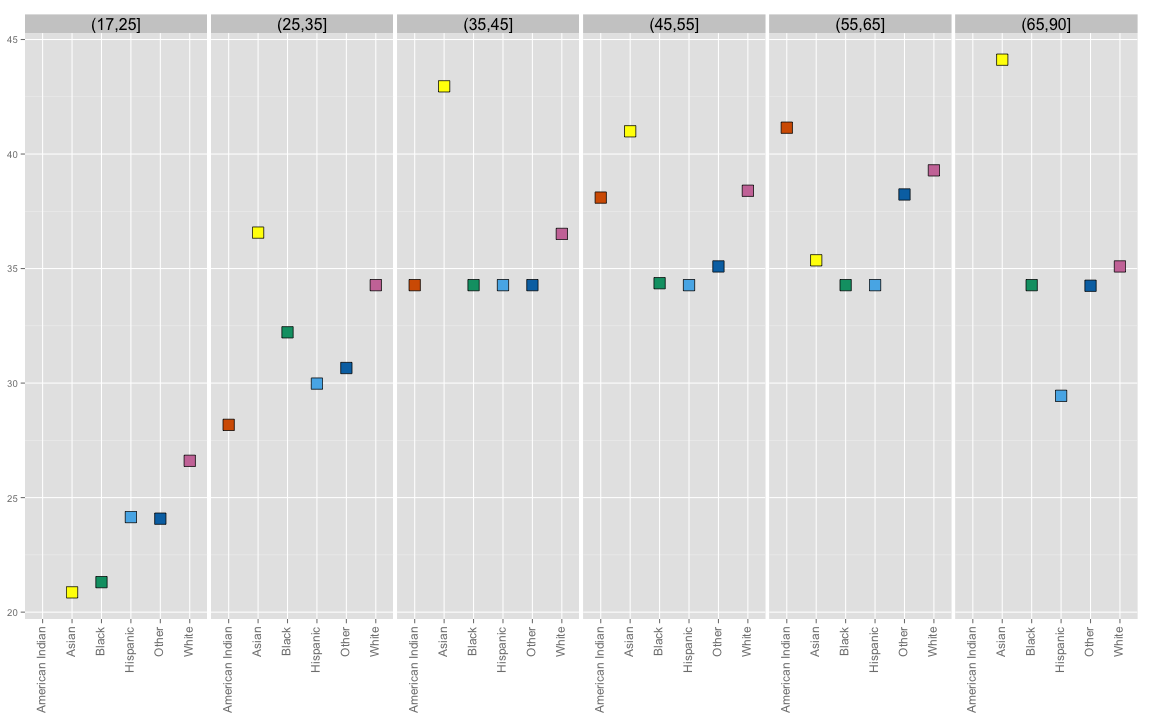
We capture some summary statistics for the median wage by age.
m_3 <- ddply(db,.(agebin,RACE), summarise,median=median(HOURLY_RT),sd=sd(HOURLY_RT))
m_3
## agebin RACE median sd
## 1 (17,25] Asian 20.86304 8.4354975
## 2 (17,25] Black 21.30967 6.4762949
## 3 (17,25] Hispanic 24.15096 4.9040771
## 4 (17,25] Other 24.08067 6.9626897
## 5 (17,25] White 26.60639 5.4926921
## 6 (25,35] American Indian 28.17626 8.9050760
## 7 (25,35] Asian 36.56954 9.5796023
## 8 (25,35] Black 32.21673 6.8826091
## 9 (25,35] Hispanic 29.97782 6.9120772
## 10 (25,35] Other 30.65795 8.9942958
## 11 (25,35] White 34.27632 7.3523969
## 12 (35,45] American Indian 34.27632 5.8830047
## 13 (35,45] Asian 42.95564 7.1397136
## 14 (35,45] Black 34.27632 7.6093695
## 15 (35,45] Hispanic 34.27632 8.0972837
## 16 (35,45] Other 34.27632 7.5039534
## 17 (35,45] White 36.51229 7.6440685
## 18 (45,55] American Indian 38.09795 5.2403027
## 19 (45,55] Asian 40.99271 11.6302109
## 20 (45,55] Black 34.36109 7.4800487
## 21 (45,55] Hispanic 34.27632 8.3391364
## 22 (45,55] Other 35.09266 7.6703743
## 23 (45,55] White 38.39668 9.7931061
## 24 (55,65] American Indian 41.14999 2.5535768
## 25 (55,65] Asian 35.36039 8.8740824
## 26 (55,65] Black 34.27632 7.3188974
## 27 (55,65] Hispanic 34.27632 8.3393259
## 28 (55,65] Other 38.23470 4.7488739
## 29 (55,65] White 39.28728 11.1704956
## 30 (65,90] Asian 44.11892 11.1903259
## 31 (65,90] Black 34.27632 10.3673390
## 32 (65,90] Hispanic 29.44429 3.9382790
## 33 (65,90] Other 34.24947 0.6051034
## 34 (65,90] White 35.09266 9.5174177It helps to plot the summary. First we plot the median by ethnicity and facet by age.
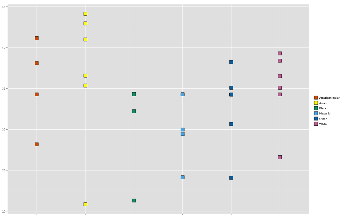
Next, plot the medians grouped by ethnicity.
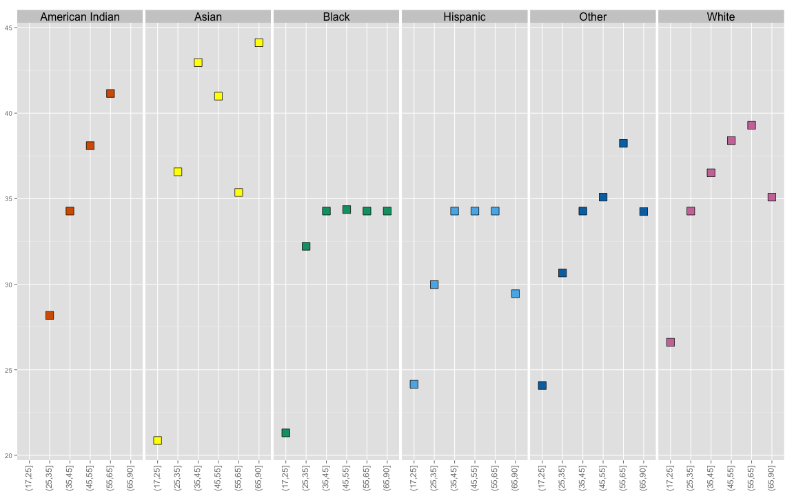
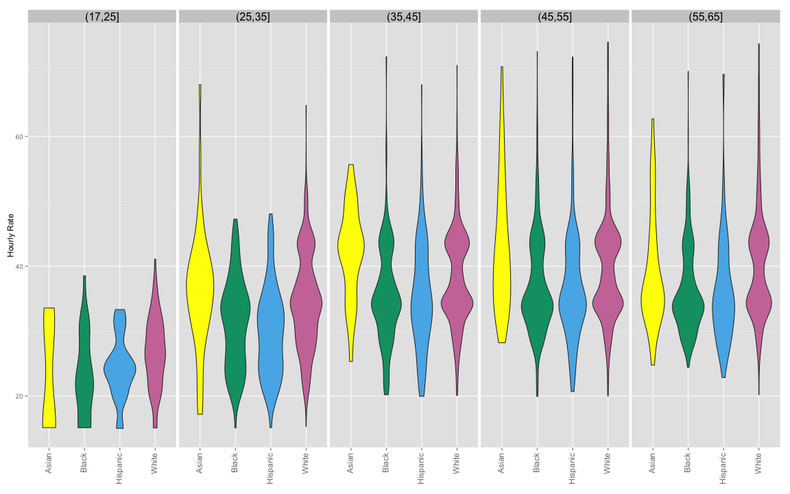
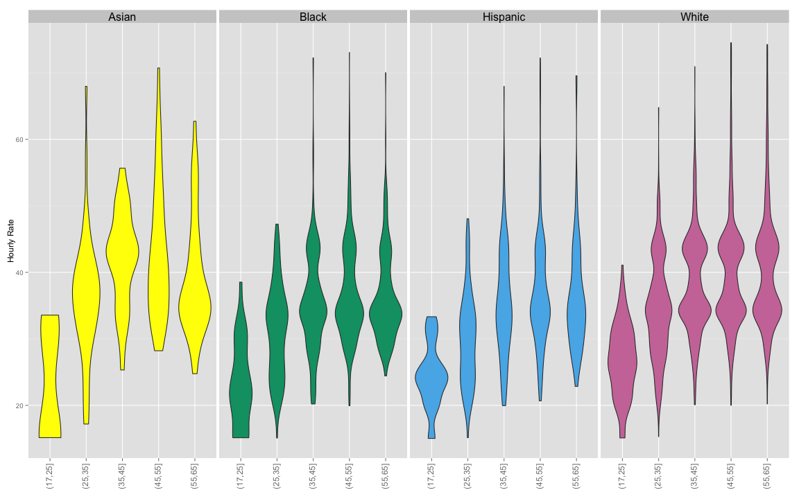
Finally, faceting by race and plotting by age group reveals that the median wage for African American and Hispanic employees levels off at about 35 years old.
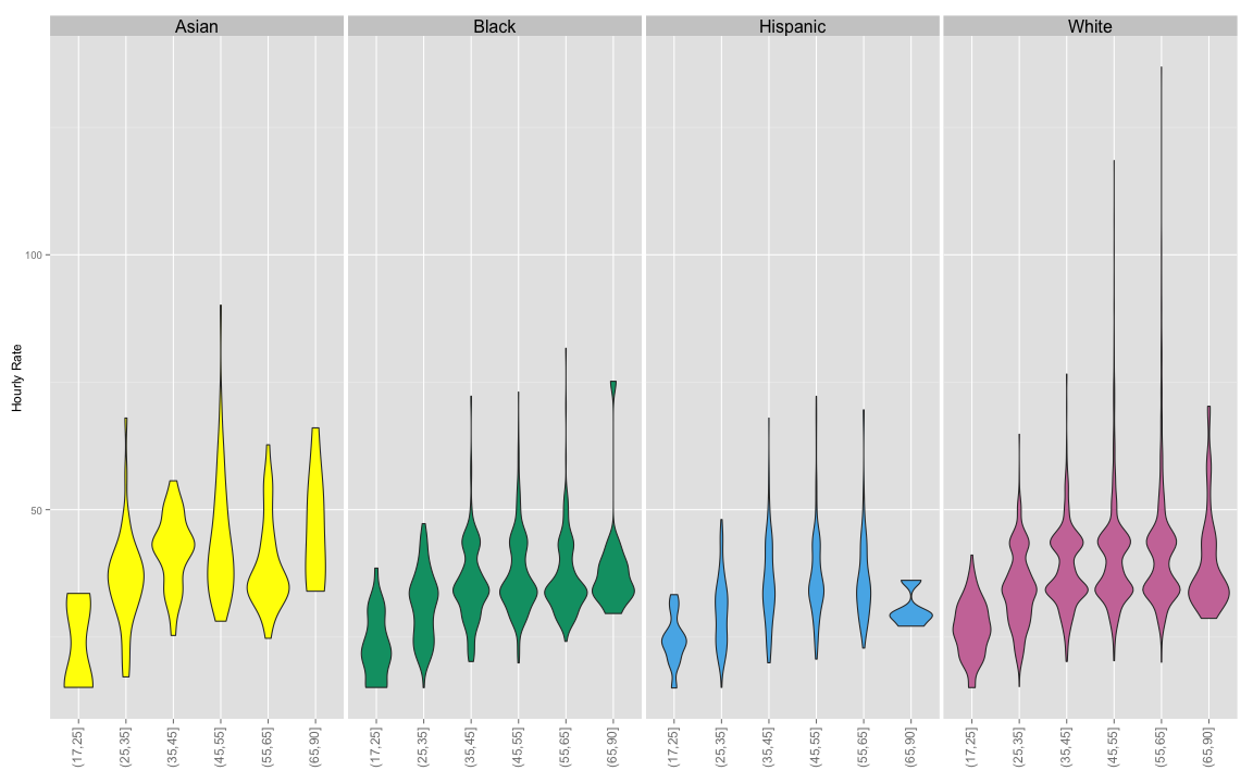
A boxplot and a violin plot both reveal very long tails for Caucasian employees.
For the violin plot, we drop American Indian and Other ethnic categories.
Highly paid corporates aside, how does the distribution look for the rest of MNR employees?
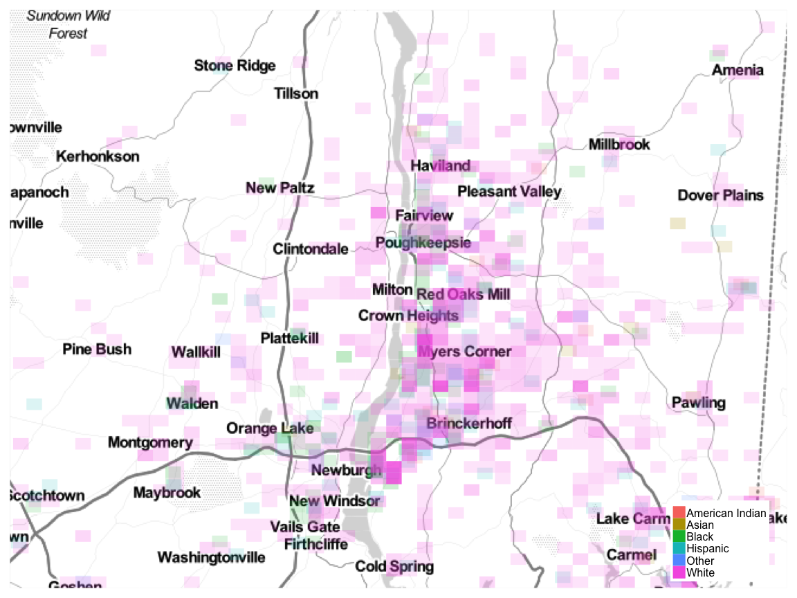
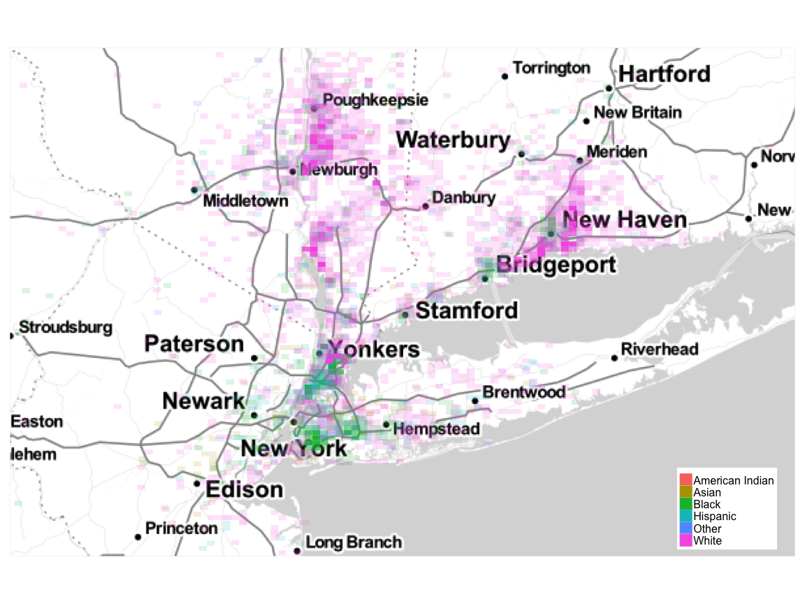
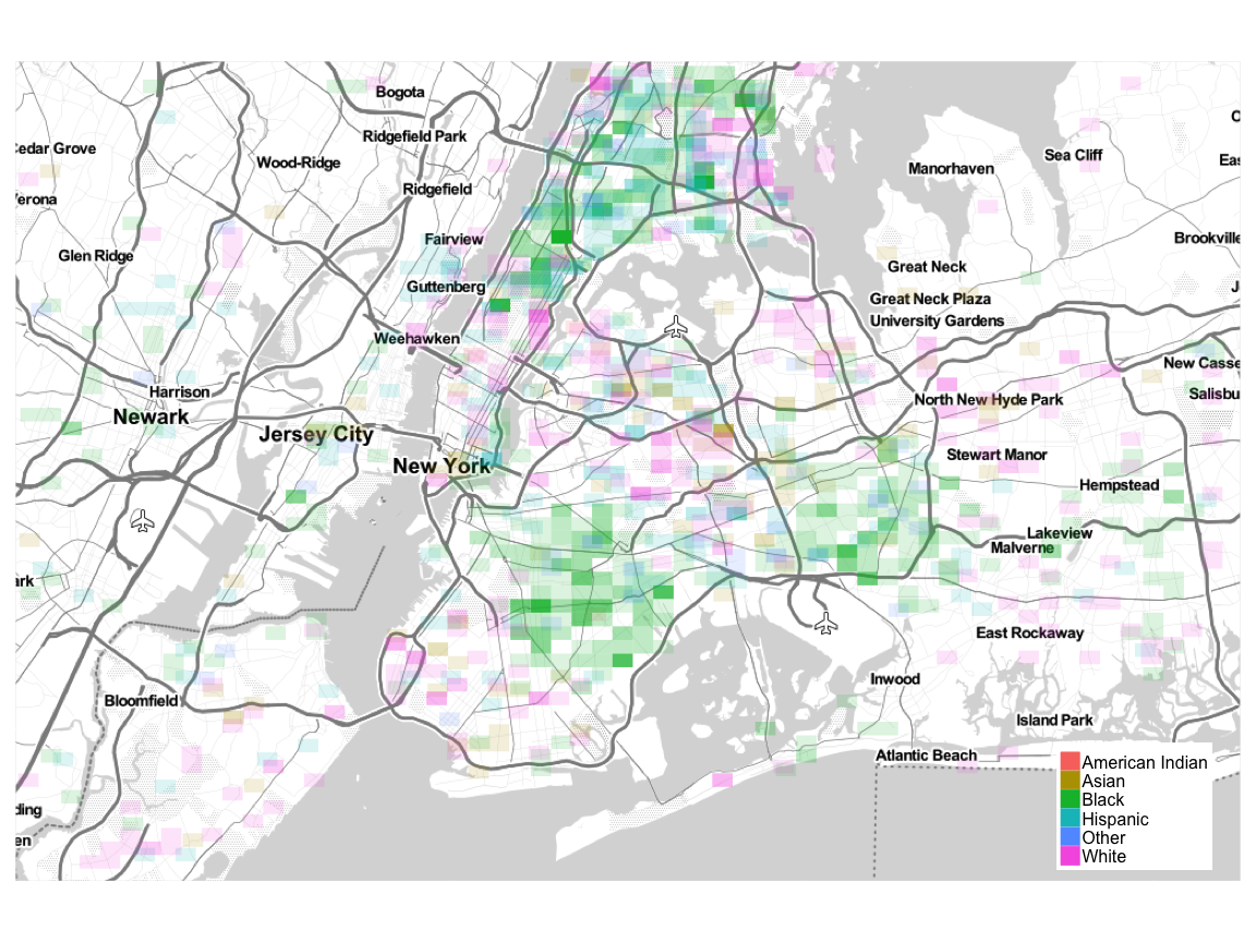
Location
We can generate an ethnic heatmap using the ggmap and ggplot2 packages. I have binned the data according to area size and assigned alpha values based on counts within a bin. A nearly transparent cell indicates only a few employees living within that area. An opaque cell indicates a high number of employees living within that area.
Employee Location Overview
New York City and New Jersey
Poughkeepsie